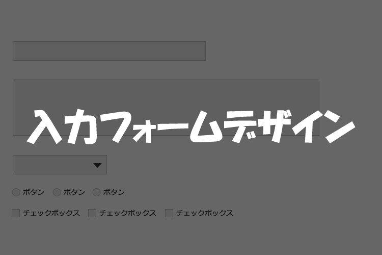
今回、デザイナーからあがったカンプの入力フォームがデザインされていたのでコーティングに時間がかかりました。
テキストタイプやテキストエリアは簡単だけど、ラジオボタン、チェックボックスは難しいです。
今回は、入力フォームで私が設定した方法をメモしておきます。
テキストタイプ
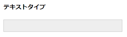
テキストタイプのデザイン変更は簡単で、pタグなどに設定するようにbackgroundやborderを指定すれば変更できます。
フォームをコーディングする際、いつもinput[type=”text”] の指定方法を忘れてしまい、毎回検索しているのでメモメモ。
また、入力欄にカーソルがある時だけ色を変えたい場合は、input[type=”text”]:focusに色を指定します。
html
<input class="text" type="text" name="テキスト">
css
input[type="text"] {
  width: 377px;
  height: 36px;
  background: #eee;
  border: 1px solid #bebebe;
  font-size: 1em;
  text-indent: 0.7em;
}
input[type="text"]:focus {
  background: #edf4ff;
  border: 1px solid #4881d9;
}
テキストエリア
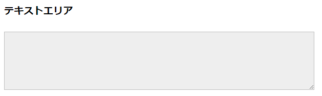
テキストエリアもテキストタイプと基本は同じ。
要素指定方法はpタグとかと同じ textarea で指定可能です。
html
<textarea name="テキストエリア" cols="50" rows="10"></textarea>
css
textarea {
  width: 600px;
  height: 108px;
  background: #eee;
  border: 1px solid #bebebe;
  font-size: 1em;
}
textarea:focus {
  background: #edf4ff;
  border: 1px solid #4881d9;
}
セレクト
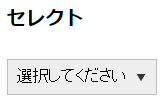
セレクトは▼部分のデザインを変更したかったので一部画像を使いました。
すみません、cssのみで変える方法がわかりませんでした。
appearance: none;で▼を非表示にします。
backgroundで▼の画像を指定し、background-size:幅 高さ;で画像のサイズを指定します。
background-positionで▼の画像位置を微調整します。
text-indent:で文字の左に少し余白を加えます。
html
<select name="select">
  <option value="">選択してください</option>
  <option value="select1">select1</option>
  <option value="select2">select2</option>
  <option value="select3">select3</option>
</select>
css
select {
  -webkit-appearance: none;
  -moz-appearance: none;
  appearance: none;
  border-radius: 0;
  background: #eee url("../img/arrow.png") no-repeat;
  background-size: 10px 7px;
  background-position: right 10px center;
  border: 1px solid #bebebe;
  width: 150px;
  height: 36px;
  font-size: 1em;
  text-indent: 0.3em;
}
select:focus {
  border: 1px solid #4881d9;
  background: #edf4ff url("../img/arrow.png") no-repeat;
  background-size: 10px 7px;
  background-position: right 10px center;
}
Chromeの仕様?入力フォームフォーカス時のシャドウを消す
フォームのデザインをカスタマイズしていて、Firefoxで確認して大丈夫だと思ってchromeで見たらなんだか変です。
入力フォーカス時に、シャドウが見えます。
調べてみるとchromeの仕様みたいですね。
デザインが変わってしまうので、focus時の設定削除をcssに書きました。
input[type="text"],textarea,select {
  outline: none;
}
ラジオボタン
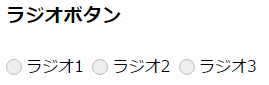
参考サイトをそのまま設置しましたが、解読が難しいので一つずつ読み解いてみます。
参考サイト:フォーム周りで覚えておくと便利なCSS Snippets
まずは、htmlにradioボタンを設置します。
この時、選択される文字にlabelを明記します。
label内のforにinputのidをを記入して、関連付けておきます。これでチェックされたかを判断してるので、必ず明記してください!
最初、forを記入していなかったので、デザイン表示は希望通りになったんですがうまく動きませんでした。
html
<input id="radio01-01" type="radio" name="ラジオ" value="ラジオ1"><label for="radio01-01">ラジオ1</label>
<input id="radio01-02" type="radio" name="ラジオ" value="ラジオ2"><label for="radio01-02">ラジオ2</label>
<input id="radio01-03" type="radio" name="ラジオ" value="ラジオ3"><label for="radio01-03">ラジオ3</label>
cssでは一度、display: none;でデフォルトのデザインを削除します。
input[type="radio"] {
  display: none;
}
labelには、position:relative;で相対位置を決めておきます。
要素の配置を決めるときの基準となります。
label {
  position: relative;
  padding: 3px 3px 3px 20px;
}
label::beforeにラジオボタンの丸枠を設定していきます。
position: absolute;を指定して、先ほどlabelに指定したposition: relative;を基準にtop: 50%;とleft: 0;で配置場所を決めていきます。
margin-top:-8px;で○の半径分の位置調整をします。
content: ”;を指定してコンテンツがあることを明記します。
border-radius: 100%;で○型にします。
label::before {
  position: absolute;
  content: '';
  top: 50%;
  left: 0;
  width: 14px;
  height: 14px;
  margin-top: -8px;
  background: #eee;
  border: 1px solid #bebebe;
  border-radius: 100%;
}
input[type=”radio”]:checked + label::after内には、ラジオボタンでチェックが入った場合の色付けを指定します。
label::beforeで設定した○の中に少し小さな●が入るようにします。
ですのでlabel::beforeの○のサイズの半分のサイズの●をwidthとheightを指定し、margin-top:-4px;で○の半径分の位置調整をします。
input[type="radio"]:checked + label::after {
  position: absolute;
  content: '';
  top: 50%;
  left: 4px;
  width: 8px;
  height: 8px;
  margin-top: -4px;
  background: #3498db;
  border-radius: 100%;
}
上記一連のcssは下記です。
input[type="radio"] {
  display: none;
}
label {
  position: relative;
  display: inline-block;
  padding: 3px 3px 3px 20px;
  cursor: pointer;
}
label::before {
  position: absolute;
  content: '';
  top: 50%;
  left: 0;
  width: 14px;
  height: 14px;
  margin-top: -8px;
  background: #eee;
  border: 1px solid #bebebe;
  border-radius: 100%;
}
input[type="radio"]:checked + label::after {
  position: absolute;
  content: '';
  top: 50%;
  left: 4px;
  width: 8px;
  height: 8px;
  margin-top: -4px;
  background: #3498db;
  border-radius: 100%;
}
チェックボックス
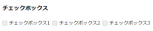
チェックボックスもラジオボックスと似たような感じです。
参考サイト:フォーム周りで覚えておくと便利なCSS Snippets
まずは、htmlにcheckboxを設置します。
この時、選択される文字にlabelを明記します。
label内のforにinputのidをを記入して、関連付けておきます。これでチェックされたかを判断してるので、必ず明記してください!
最初、forを記入していなかったので、デザイン表示は希望通りになったんですがうまく動きませんでした。
<input type="checkbox" id="checkbox01" name="チェックボックス[]" value="チェックボックス1"><label for="checkbox01">チェックボックス1</label>
<input type="checkbox" id="checkbox02" name="チェックボックス[]" value="チェックボックス2"><label for="checkbox02">チェックボックス2</label>
<input type="checkbox" id="checkbox03" name="チェックボックス[]" value="チェックボックス3"><label for="checkbox03">チェックボックス3</label>
cssでは一度、display: none;でデフォルトのデザインを削除します。
input[type="checkbox"] {
  display: none;
}
labelには、position:relative;で相対位置を決めておきます。
要素の配置を決めるときの基準となります。
label {
  position: relative;
  padding: 3px 3px 3px 22px;
}
label::beforeにチェックボックスの四角枠を設定していきます。
position: absolute;を指定して、先ほどlabelに指定したposition: relative;を基準にtop: 50%;とleft: 0;で配置場所を決めていきます。
margin-top:-8px;で□の半径分の位置調整をします。
content: ”;を指定してコンテンツがあることを明記します。
label::before {
  position: absolute;
  content: '';
  top: 50%;
  left: 0;
  width: 14px;
  height: 14px;
  margin-top: -8px;
  background: #eee;
  border: 1px solid #bebebe;
}
input[type=”checkbox”]:checked + label::after内には、チェックボックスでチェックが入った場合の色付けチェックマークを表示させます。
label::beforeで設定した□の中にチェックマークが入るようにします。
border-leftとborder-bottomをtransform:rotate(-45deg);で45度回転させます。
border-leftとborder-bottomはwidthとheightで指定した中におさまります。
input[type="checkbox"]:checked + label::after {
  position: absolute;
  content: '';
  top: 5px;
  left: 3px;
  width: 13px;
  height: 5px;
  border-left: 2px solid #3498db;
  border-bottom: 2px solid #3498db;
  -webkit-transform: rotate(-45deg);
  transform: rotate(-45deg);
}
上記一連のcssは下記です。
input[type="checkbox"] {
  display: none;
}
label {
  position: relative;
  display: inline-block;
  padding: 3px 3px 3px 22px;
  cursor: pointer;
}
label::before {
  position: absolute;
  content: '';
  top: 50%;
  left: 0;
  width: 14px;
  height: 14px;
  margin-top: -8px;
  background: #eee;
  border: 1px solid #bebebe;
}
input[type="checkbox"]:checked + label::after {
  position: absolute;
  content: '';
  top: 5px;
  left: 3px;
  width: 13px;
  height: 5px;
  border-left: 2px solid #3498db;
  border-bottom: 2px solid #3498db;
  -webkit-transform: rotate(-45deg);
  transform: rotate(-45deg);
}
css3はできることがたくさんあって便利だけど、未知なことが多いです。
できるようになったら楽しくなりそうですが、道のりはまだまだながそうです。